Work IT Smarter, not harder
Moodle – Better UI/UX
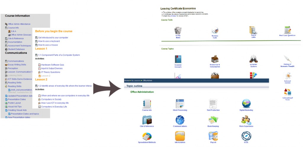
Many users of Moodle consider the long scrolling page of a full course to be a disadvantage in terms of navigation and visual appeal. This technique gives the teacher and learners an improved user interface and user experience.
By using ‘only a bit of HTML code’ otherwise known as a table in plain English to hold shortcuts to web pages (that contain topic/subject resources & activities), it is easier and faster to find your way to the different subjects within a course. Of course, it makes the front page of the course look very well – rather like the cover of a book.
As a course grows, it may become a victim of its own success – otherwise described as the ‘scroll of death’ may return. Good design at the start will pay off as your course develops. Getting fed up of scrolling to the end of a (very long) page (every day for most of the first year using Moodle), I decided there was an improvement to be made to the courses I was using.
Please download the Make Moodle Look Good using HTML- Quick Guide PDF as requested by some at #cesimeet and #cesi40 for the exact steps to make your Moodle course front page look good! Would love to see your completed front page……
Comments are closed.