Work IT Smarter, not harder
Learning
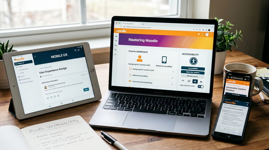
Great educational experiences don’t happen by accident; they are intentionally designed around how humans think, move, and interact. Moving beyond traditional web design, this space focuses on holistic learning experience design (LXD): ensuring every learner, regardless of device or ability, can engage seamlessly with content.
Designing for Learners: Experience, Access, and Engagement
For a long time, people talked about “web design” as if it were just about layout, custom CSS, or making a page look pretty. But when it comes to education, layout is only a fraction of the story.
What truly matters is how a learner experiences your space.
Moving away from traditional web design, my focus centers on Learning Experience Design (LXD): the art and science of structuring information so that it is intuitive to navigate, seamless on any device, and open to every single learner.
Here is how we turn these broad principles into practical, highly effective Moodle environments.
1. User Experience (UX): Reducing Friction & Cognitive Load
Great UX in learning means removing every unnecessary click, confusing menu, or wall of text that stands between a student and their learning goals. If a student is spending energy figuring out where to click, they aren’t spending energy learning.
How to apply this in Moodle:
-
Ditch the “Scroll of Death”: Instead of dumping 50 items onto a single section on your course main page, use the One Section Per Page layout or the Tiles Format plugin.
-
Leverage the Moodle Book Resource: For long-form reading, don’t upload a 20-page PDF. Use a Book resource to chunk content into short, structured chapters with built-in table of contents navigation.
-
Smart Use of Labels & Activity Cards: Use Text and Media Areas (formerly Labels) to create subtle, visual callouts. Group related items logically—like placing a brief Forum discussion prompt right beneath the reading page that sparks it.
2. Mobile Experience: Learning Anywhere, Anytime
Learners today rarely sit at a desktop computer for hours on end. They review notes on their phone during a commute, check assignment due dates on a tablet, or complete quick quizzes on the go. If a course isn’t built for touchscreens, it isn’t built for modern learners.
How to apply this in Moodle:
-
Design for the Moodle Mobile App: Test your course directly on a mobile device or through the official Moodle app. Ensure your core activities—like Quizzes, Forums, and Choice activities—render cleanly on a vertical screen.
-
Keep Media Lightweight: Embed responsive HTML5 videos (with custom poster images) instead of hosting massive, uncompressed video files that consume heavy mobile data.
-
Touch-Friendly Buttons: Replace tiny textual inline links with clear, full-width action buttons or card layouts that are easy to tap with a thumb.
3. Accessibility Experience (A11y): Universal Access by Default
Accessibility isn’t an afterthought or a “nice-to-have” feature—it is foundational. Designing with accessibility in mind ensures that learners with visual, auditory, motor, or cognitive differences have equal access to knowledge. Bonus: accessible design universally improves the experience for everyone.
How to apply this in Moodle:
-
Structure Text with True Headers: Never just bold text and make it larger. Use Moodle’s built-in Atto or TinyMCE editor to select proper heading tags (
<h2>,<h3>). This allows screen readers to navigate your page structure logically. -
Meaningful Image Alt Text: Every image added inside a Moodle Page or Text Area should have descriptive alt text explaining its educational context—or be marked as “decorative” if it serves no instructional purpose.
-
Built-In Accessibility Checkers: Use the native Accessibility Checker button right in the Moodle text editor toolbar before saving your page. It instantly flags low color contrast, missing image descriptions, or incorrect header hierarchies.
-
Transcripts for Audio & Video: Pair every embedded video or audio record with a clean text transcript or closed captions (
.vttfiles), enabling both hard-of-hearing students and those studying in quiet environments to follow along seamlessly.
The Learning Design Checklist
Before launching any new section or resource in Moodle, run it through this quick three-question check:
UX Check: Is it immediately obvious what the learner should read, do, or submit next?
Mobile Check: Can a student comfortably read and interact with this on a small smartphone screen?
Accessibility Check: Does every image have alt text, every video have captions, and every heading use proper structural tags?
Let’s Build Better Learning Spaces
Whether you are looking to audit an existing course, integrate new open-source tools, or experiment with local AI assistants inside Moodle, crafting a great experience starts with putting the learner first.